Reading a Japanese film look, numerically.
"Japanese photography look" is one of those phrases that everyone recognises and nobody defines. Soft, airy, slightly green, quiet. It gets attributed variously to Fujifilm chemistry, to overcast Tokyo light, to a particular generation of street photographers, and to the way scanners were configured in a handful of Japanese labs. All of those are probably a little bit true.
Rather than argue about origins, here is the Komorebi preset taken apart parameter by parameter, with what each one is doing and why it is set where it is.
Exposure +0.26 EV, shadows +18, blacks +10
The look starts by being brighter than correct. A quarter of a stop is small enough that it does not read as an exposure error, but it is enough to move the whole image off the neutral midpoint. The shadow and black lifts then pull the bottom of the range up further, so the darkest parts of the frame land in the lower midtones rather than near zero.
This is the high-key half of the look. High key does not mean overexposed; it means the tonal mass sits above middle grey with relatively little below it. Overcast daylight produces this naturally, which is part of why the aesthetic is associated with a climate.
Contrast −14, fade 16
Negative contrast in this pipeline is not an inverted S-curve; it is a pull toward mid grey — at full strength the distance of every pixel from 0.5 is scaled to 45% of what it was. At −14 the effect is gentle, roughly an 8% compression toward the middle.
Fade at 16 is the highest value across all eight presets. Combined with the contrast reduction, the black point ends up meaningfully off the floor. This is the single most identifiable element of the look, and it is also the one most often overdone by people trying to copy it — the difference between airy and washed out is about eight points on this slider.
Temperature −8, tint −6
Both slightly negative: a touch cooler, a touch greener. In the grading pass, temperature is applied as a channel gain in linear light — warm lifts red and drops blue, symmetrically. Tint trades green against magenta, with a small compensating adjustment to red and blue so that shifting green does not also shift overall brightness.
The green lean is the detail that most distinguishes this look from a generic "bright and soft" edit. Open shade under a clear sky is genuinely blue; open shade under foliage is genuinely green. A very small green push reads as the second one, and brings with it the whole association of light filtered through leaves. The name of the preset — komorebi, the Japanese word for exactly that phenomenon — is the thesis.
Saturation −16, vibrance +8
These pull in opposite directions on purpose. Overall saturation comes down noticeably, which is what gives the look its restraint. Vibrance then adds a small boost that lands preferentially on the least saturated pixels — pale sky, concrete, white walls — so the image desaturates without going grey and lifeless.
Getting this pairing right is most of the difficulty. Reducing saturation alone produces something drab. Reducing it and then selectively returning a little to the flat areas produces something that reads as understated, which is a completely different impression.
Split tone: #3f6b62 at 30, #fdf6e6 at 22
The shadow tint is a muted green-teal. The highlight tint is not white — it is a very pale warm cream, the colour of paper rather than of a screen.
That highlight choice does a lot of quiet work. Pure white highlights read as digital display output. Slightly warm, slightly yellow highlights read as a print, a scan, or a window. It costs 22% of a soft-light blend applied only to the top of the range, and it changes the whole character of the image.
Diffusion 26, halation 16, grain 9
Diffusion is the largest of the three, and it is the untinted one — a screen blend of the blurred highlight layer back over the image, which is the digital equivalent of putting a Black Pro-Mist filter in front of the lens. It bleeds bright areas into dark ones and softens micro-contrast without softening focus. This is where the "airy" quality comes from.
Halation is deliberately low at 16, with a pale peach bleed colour rather than the default red-orange. The look is not a night look; there is rarely a specular highlight bright enough to warrant a strong corona, and a strong one would fight the diffusion.
Grain at 9 is the lowest in the set. Heavy grain implies pushed film and low light. This aesthetic implies plenty of light and a slow, fine-grained stock, so the texture needs to be present but almost subliminal.
What to change first
The preset is a starting point, and two parameters are worth adjusting per image rather than accepting.
- Fade, because the correct value depends entirely on how much genuine shadow the photograph contains. A frame shot in flat overcast light needs less than the preset gives it.
- Tint, because the green lean is flattering on foliage, concrete and pale walls, and unflattering on skin in close-up. For a portrait, pulling tint back toward zero while leaving everything else alone usually resolves it.
Everything else in the list above is structural. Change those two and the look survives; change diffusion and saturation and you are somewhere else entirely.
Try it on a real photo
Start with Komorebi, then adjust Exposure and Fade. Watch the island shadows as you lower Look intensity to bring back depth.
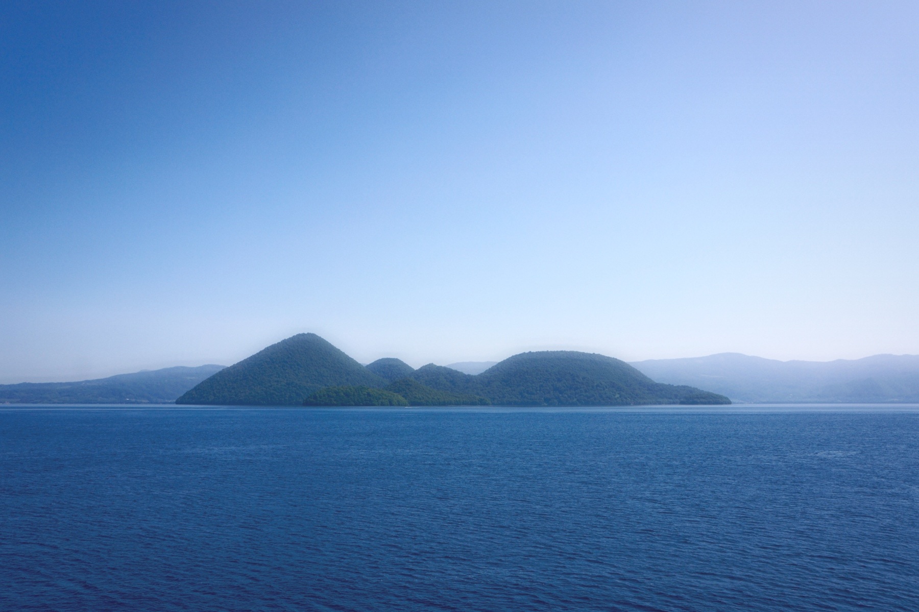
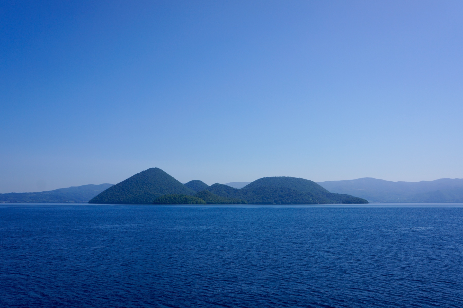 OriginalKomorebi
Then choose Replace to use your own photo or clip. New here? Read the photo guide or video guide.